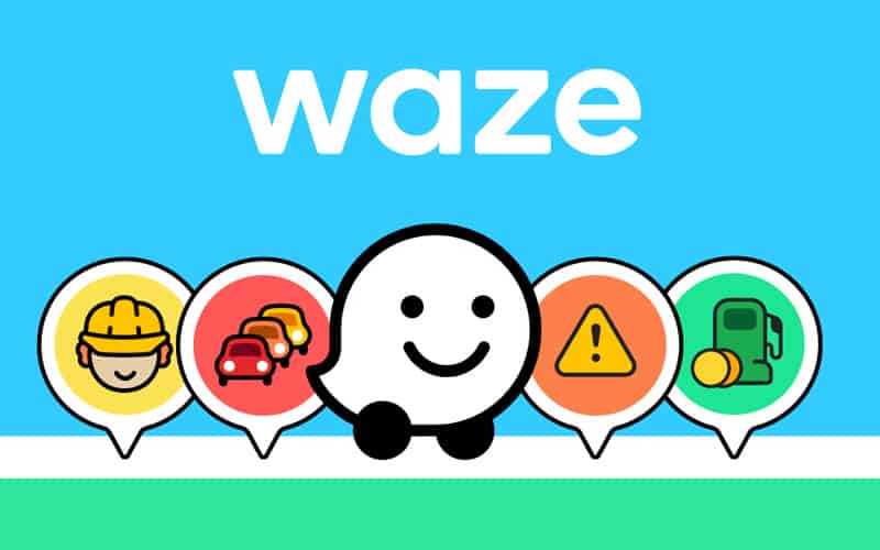
With most software going down the ‘dark mode’ route in their design, Waze has gone the complete opposite direction and made their redesign more colorful than the last.
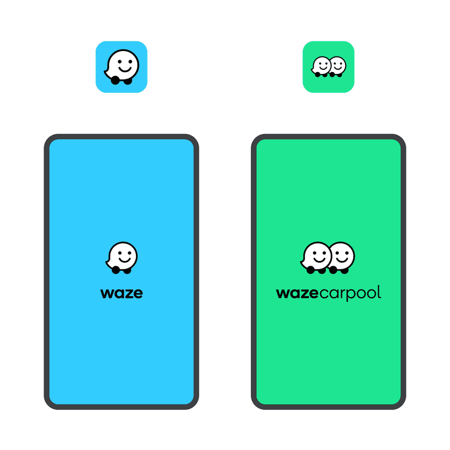
If you’re wondering what Waze actually is, essentially it’s a navigation app that’s owned by Google and works via GPS to give you turn-by-turn navigation, similar to that of older tech Sat Navs. They also have a carpooling app that has an Uber-like feel but not the same taxi-like experience, allowing individuals to both save on costs and have a little conversation along the way.
Waze has redesigned both of these apps, giving them a fresh look and feel boasting a simple, yet colorful approach. The home screens of both have a block color background that really pops with the original Waze app sporting a blue color variant and the Waze Carpool app opting for a mint green. The Waze logo also features a new font, allowing a clear contrast between that and the background. You’ll similarly see these changes throughout the apps, showcasing colors of purple, orange, and yellow accompanying the aforementioned hues.
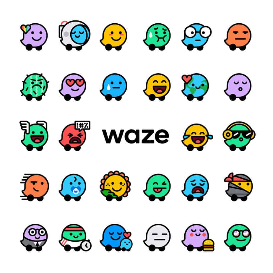
Not only have these home screen and logo changes been implemented but also a big overhaul in their icons. These 30 different “Moods” offer a bunch of reactions ranging from a happy sunflower to a sad cactus, providing users with a fun way of adding some customizability to their posts.
What do you think of this redesign? I think it’s a nice change of pace coming from most companies trying to go as dark as possible in their color choices. With the addition of the different “Mood” icons, it also emits a fun and uplifting vibe for those that are using the service which in my eyes, is perfect branding for Waze as a whole.